Pick Your Trip

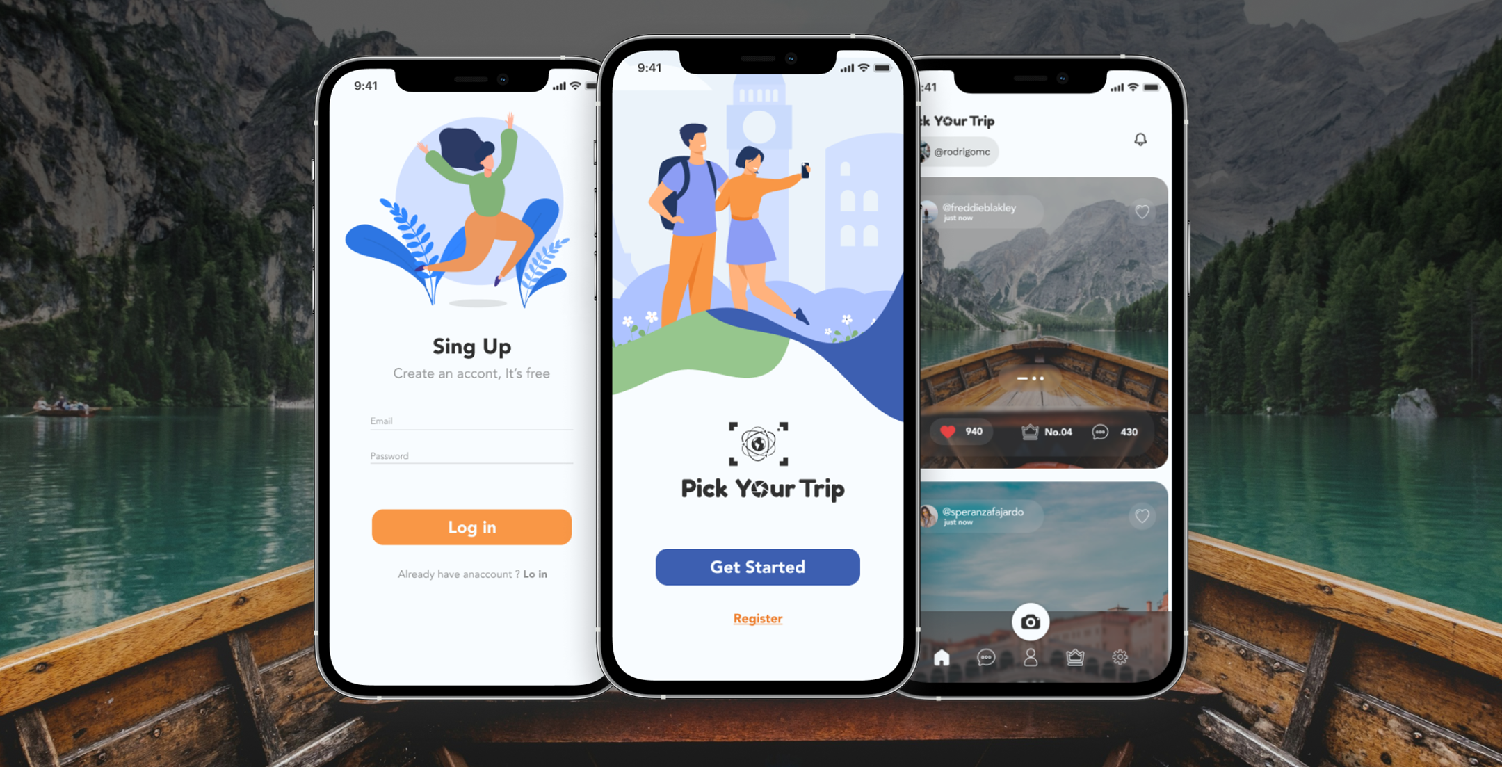
Pick your Trip was created in 2019 with the intention of being a very intuitive application and its purpose is to generate and share experiences on your trips. Its purpose is to share your trips through images and videos, with your friends and with others registered in the application, making you expand your friendship networks. Its purpose is to generate a monthly ranking with the best photos, the winner can have discounts on their next trip with associated companies. This way people can enjoy the trip without any problems.

Client
Pick Your Trip
Type
Product design
Year
2019

My Role

As a Product Designer, I played a central role in the project by:

  • Research & Insights: Conducted generative and qualitative interviews, gathering actionable insights into user behaviors and pain points.
  • Wireframes and Prototypes:s Designed wireframes and interactive prototypes to visualize user flows and refine features through usability testing.
  • A/B Testing: Led A/B testing initiatives to optimize key interface elements, such as the photo upload flow and ranking visibility, ensuring data-driven design decisions.
  • Cross-Functional Collaboration: Partnered with developers and stakeholders to align design iterations with technical feasibility and business goals.

Process

About the research

Objective


To create a user-centric travel-sharing app that prioritizes visual content and social interaction while addressing the needs of frequent travelers and content creators.

Key Research Steps

1.Competitor Analysis and Benchmarking

  • Action: Researched platforms like Instagram, Pinterest, and travel apps to study interface design and community engagement strategies.
  • Findings: Users value clean, intuitive interfaces. To stand out, we focused on a simplified, travel-exclusive experience that avoided feature overload.

2.Interviews with Potential Users

  • Action: Conducted qualitative interviews with frequent travelers, influencers, and social media enthusiasts to understand their content-sharing behaviors.
  • Findings: Users preferred sharing photos and videos to document trips and were inspired by connecting with like-minded travelers. This validated our focus on visual content and social interaction.

3.Creation of User Personas

  • Action: Developed personas representing audience segments such as young adventurers, family vacationers, and photography enthusiasts.
  • Findings: These personas guided feature prioritization, like a fast photo upload process and interactive elements (e.g., likes, comments, and follower networks).

4.Prototype Testing

  • Action: Designed and tested low- and high-fidelity prototypes to refine features like the photo upload flow, social interactions, and monthly ranking visibility.
  • Findings: Simplifying the photo upload process and enabling batch uploads was crucial.
  • Users appreciated the ranking system but wanted better visibility of their position, prompting us to add progress notifications.

5.Iteration Based on Feedback

  • Action:Adjusted app features based on user feedback, including simplified navigation, enhanced ranking updates, and improved network exploration.
  • Outcome: Iterative design cycles significantly enhanced the app’s usability and alignment with user needs.
Process


Process

My Role

As a Product Designer, I played a central role in the project by:

  • Research & Insights: Conducted generative and qualitative interviews, gathering actionable insights into user behaviors and pain points.
  • Wireframes and Prototypes:s Designed wireframes and interactive prototypes to visualize user flows and refine features through usability testing.
  • A/B Testing: Led A/B testing initiatives to optimize key interface elements, such as the photo upload flow and ranking visibility, ensuring data-driven design decisions.
  • Cross-Functional Collaboration: Partnered with developers and stakeholders to align design iterations with technical feasibility and business goals.

About the research

Objective

To create a user-centric travel-sharing app that prioritizes visual content and social interaction while addressing the needs of frequent travelers and content creators.

Key Research Steps

1.Competitor Analysis and Benchmarking

  • Action: Researched platforms like Instagram, Pinterest, and travel apps to study interface design and community engagement strategies.
  • Findings: Users value clean, intuitive interfaces. To stand out, we focused on a simplified, travel-exclusive experience that avoided feature overload.

2.Interviews with Potential Users

  • Action: Conducted qualitative interviews with frequent travelers, influencers, and social media enthusiasts to understand their content-sharing behaviors.
  • Findings: Users preferred sharing photos and videos to document trips and were inspired by connecting with like-minded travelers. This validated our focus on visual content and social interaction.

3.Creation of User Personas

  • Action: Developed personas representing audience segments such as young adventurers, family vacationers, and photography enthusiasts.
  • Findings: These personas guided feature prioritization, like a fast photo upload process and interactive elements (e.g., likes, comments, and follower networks).

4.Prototype Testing

  • Action: Designed and tested low- and high-fidelity prototypes to refine features like the photo upload flow, social interactions, and monthly ranking visibility.
  • Findings: Simplifying the photo upload process and enabling batch uploads was crucial.
  • Users appreciated the ranking system but wanted better visibility of their position, prompting us to add progress notifications.


5.Iteration Based on Feedback

  • Action:Adjusted app features based on user feedback, including simplified navigation, enhanced ranking updates, and improved network exploration.
  • Outcome: Iterative design cycles significantly enhanced the app’s usability and alignment with user needs.


Quantitative Research

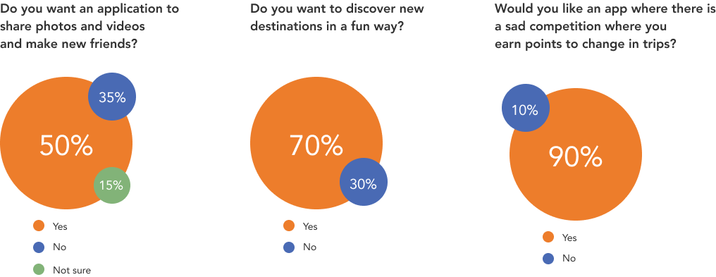
We conducted an online survey using Google Forms to gather insights into the preferences and needs of potential users.
With a total of 310 responses, the survey provided valuable data that revealed patterns and commonalities in user behavior. This feedback was instrumental in accurately defining the problem and shaping our design and feature priorities.


We conducted both online surveys and user interviews to generate valuable insights into user needs and preferences. These methods allowed us to collect both quantitative and qualitative data, which shaped our decision-making process.

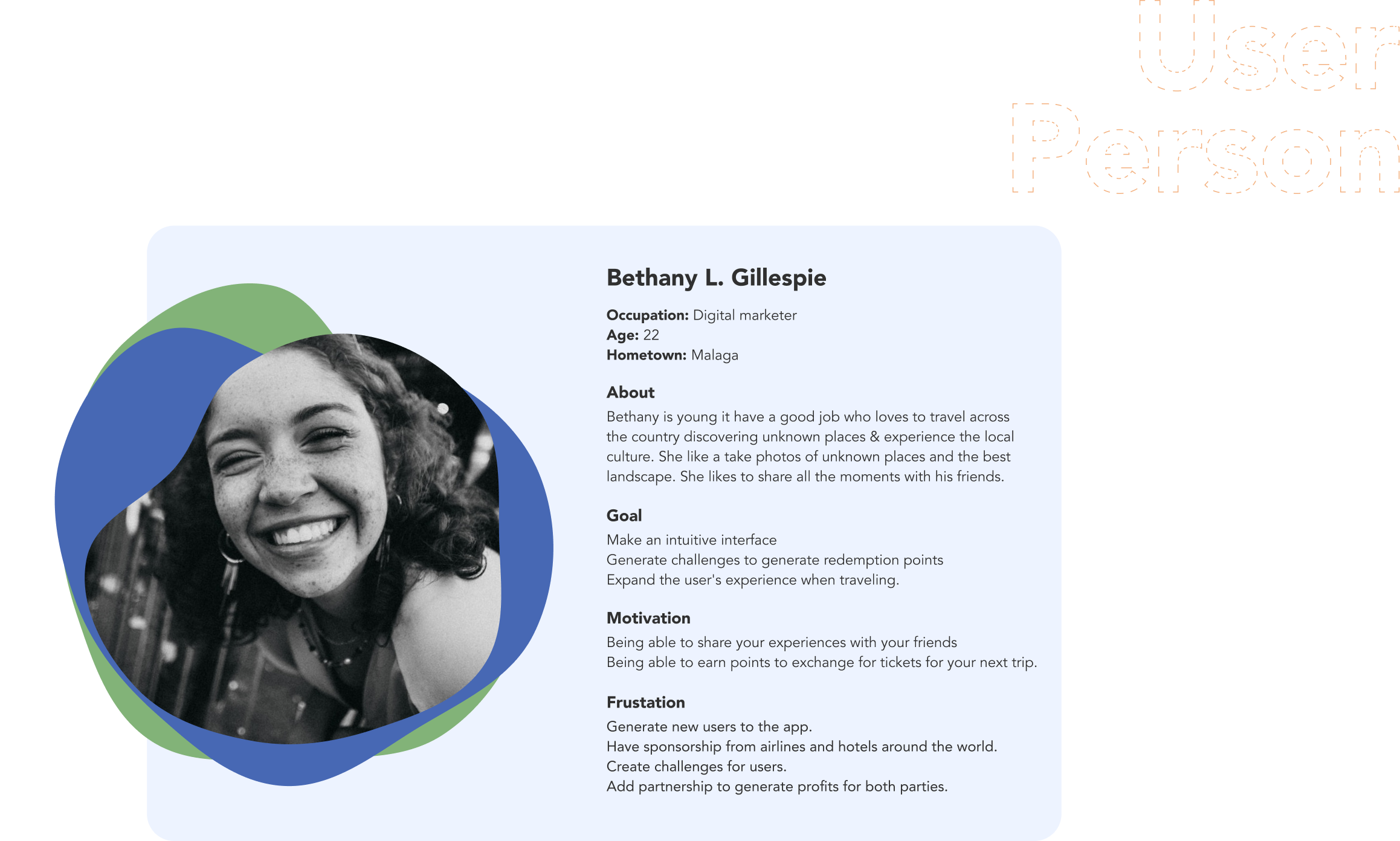
Development Process of the User Persona


1.Research Methods:


  • Conducted surveys targeting young professionals interested in travel and digital tools.
  • Held interviews with users aged between 20-30 years to identify behavioral patterns and preferences.
  • Analyzed user feedback to understand challenges when planning trips and sharing travel experiences.
2.Key Insights:


  • Users seek intuitive interfaces that simplify trip planning and social sharing.
  • There is a high demand for gamification elements like challenges that reward users with points.
  • Sharing experiences with friends is a strong motivator for this demographic.

3.Pain Points:


  • Difficulty finding platforms with integrated incentives, such as airline and hotel partnerships.
  • Limited opportunities to redeem points for meaningful rewards or discounts.
4.Persona Synthesis:


  • Created a fictional representation (Bethany L. Gillespie) based on the collected data, emphasizing traits like her love for discovering new places and her social sharing habits.
  • Highlighted her goals, such as improving her travel experience and earning points for rewards, which align with the product's value proposition.

5.Refinement:


  • Validated the persona's characteristics with the research data to ensure they represent the target user accurately.

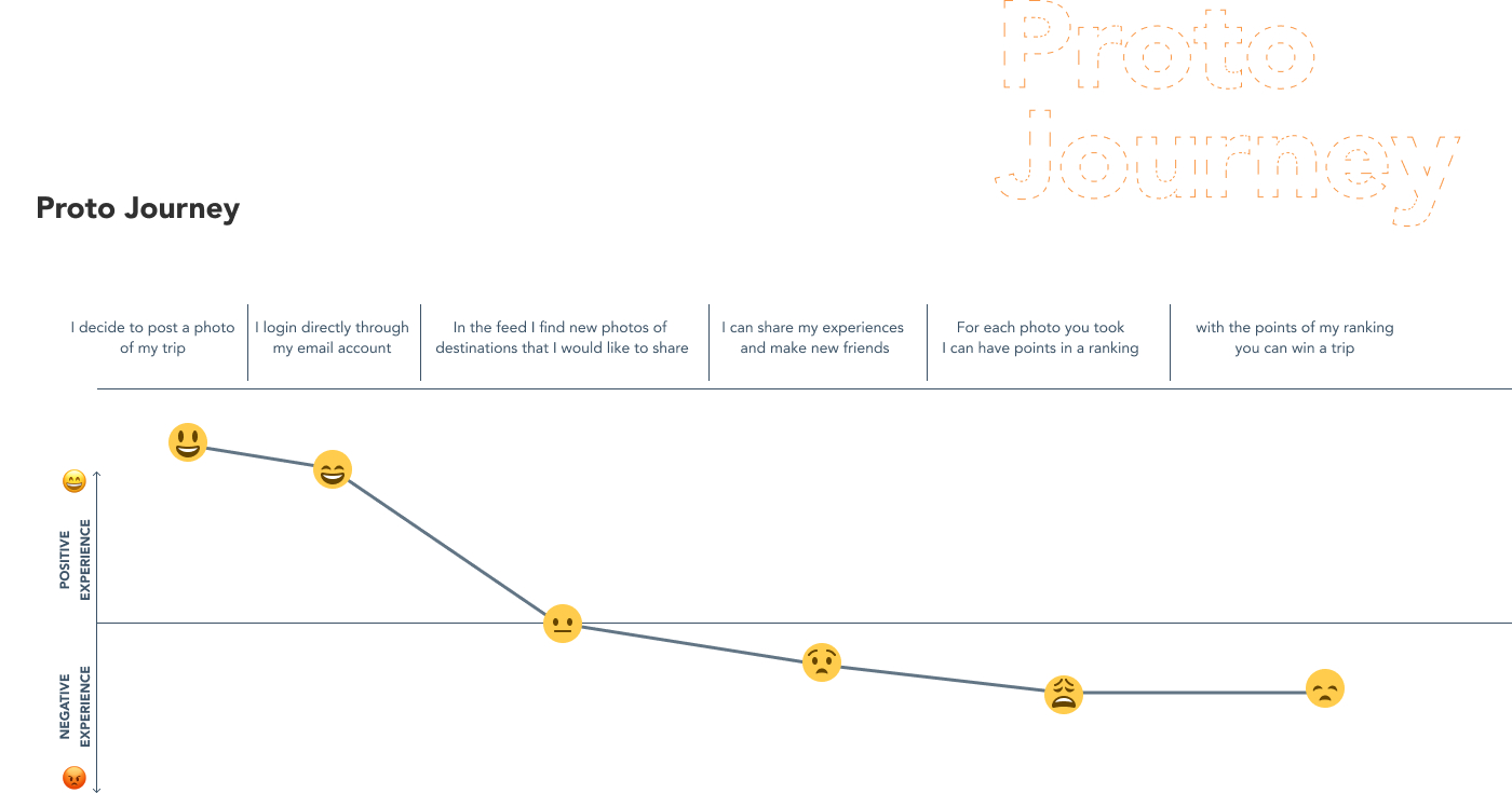
Connection Between User Persona and User Flow


1.Foundation:


  • The User Persona, Bethany L. Gillespie, provided critical behavioral insights:
  • Bethany values intuitive navigation that enables seamless interaction.
  • Her motivation to share experiences and earn rewards shaped the flow's focus.
2.Insights Derived from Research:


  • Ease of Registration: Identified the need for a simple onboarding process to lower entry barriers for first-time users.
  • Core Functionalities:
  • Prioritized features like gallery access and the ability to edit and save photos to align with Bethany's love for photography and sharing moments.
  • Gamification elements, such as ranking systems, were added to encourage engagement and reward loyalty.
  • Personalization:
  • Included settings for data updates and profile customization to enhance user ownership and satisfaction.

3.Pain Points Addressed:


  • Tackled challenges such as complicated reward redemptions by streamlining the "Change Points" flow, making it easy to check prices and select gifts.
  • Simplified the help section, ensuring users have clear communication channels with the company.
4.Journey Highlights:


  • The flow begins with quick access decisions, guiding users whether they are registered or need to sign up.
  • Focus on key interaction points:
  • Home Feed as the hub of exploration.
  • Call-to-action sections like "Gallery" and "Ranking" to maintain user engagement.
  • End goal: Smooth exit options after accessing help, redeeming rewards, or updating data.

5.Refinement:


  • Iteratively adjusted the flow based on user feedback to ensure clarity, efficiency, and alignment with Bethany's goals and motivations.

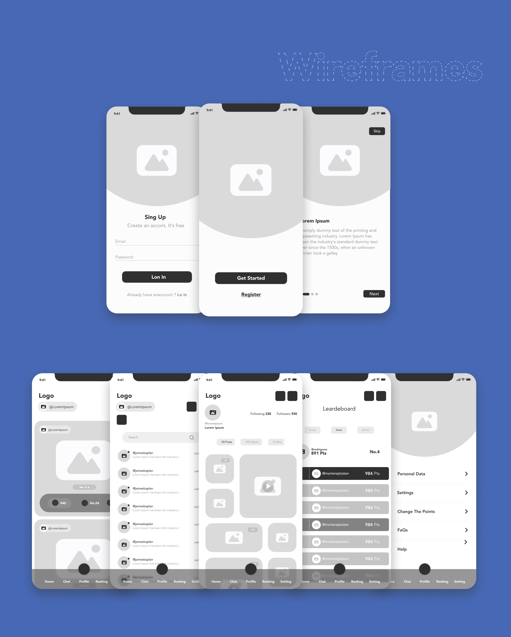
Low Fidelity Wireframe

Methodologies Applied

1.User-Centered Design:


  • Based on insights from the User Persona, we identified the primary goals, motivations, and frustrations of users like Bethany.
  • Focused on simplicity and intuitiveness to ensure ease of navigation.

2.Design Thinking:


  • Empathize: Gathered user insights through interviews and surveys.
  • Define: Synthesized feedback to establish a clear problem statement: Create a visually simple yet functional interface.
  • Ideate: Brainstormed features that align with user needs, such as a leaderboard for gamification and photo-sharing capabilities.

3.Lean UX Approach:


  • Prioritized rapid iterations to test assumptions and incorporate feedback efficiently.
  • Focused on delivering essential features first, ensuring they align with the overall user journey.

Key Design Decisions

1.Navigation:


  • Opted for a bottom navigation bar to provide users with quick access to primary features like Home, Chat, Profile, and Rankings.
  • Ensured consistent placement across screens for familiarity.

2.Onboarding Experience:


  • Designed a simple registration flow with minimal inputs to reduce friction for new users.
  • Added a “Get Started” screen to guide users into the app intuitively.

3.Core Features:


  • Focused on the gallery and leaderboard, aligning with user motivations to share photos and engage with gamified elements.
  • Included options for profile customization to improve personalization.

4.Hierarchy and Visual Simplicity:


  • Used minimalistic layouts with clear divisions to avoid overwhelming users.
  • Prioritized elements based on importance, with a focus on user actions like uploading photos or viewing rankings.

Summary of Impact

By combining research-driven insights with iterative methodologies, we created a wireframe that balances functionality and simplicity. These decisions ensure the app is both engaging and easy to navigate, directly addressing the user's goals and pain points.

High Fidelity Wireframe


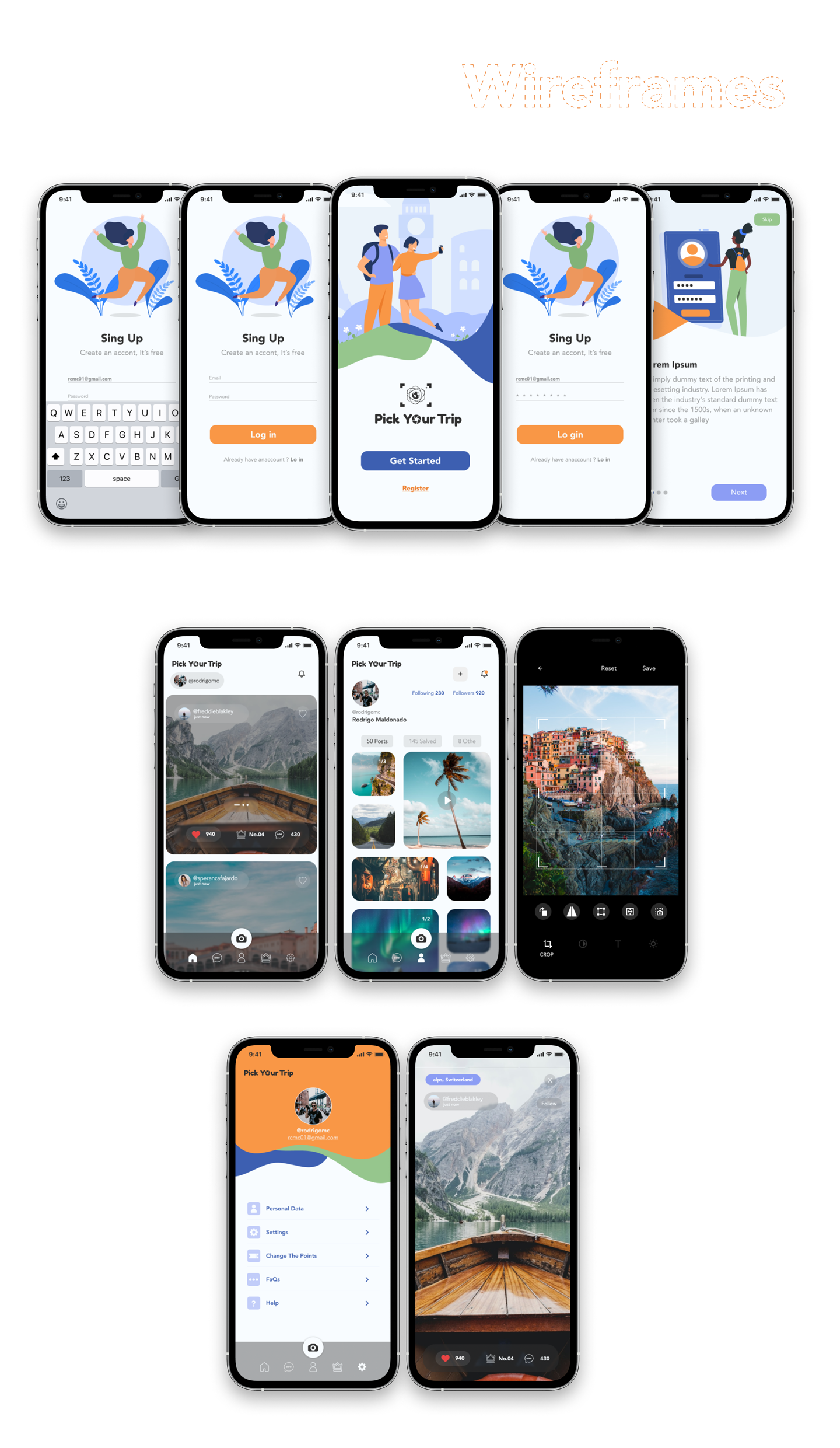
The high-fidelity wireframes demonstrate the evolution from conceptual design to a refined user interface, ensuring clarity, usability, and aesthetics. Below are the key decisions and justifications:

Key Decisions and Justifications:

1.Consistency in Visual Language:


  • Uniform color palette and typography throughout ensure a cohesive experience.
  • Rounded buttons and smooth transitions create a modern and friendly interface.
2.User Onboarding Flow:


  • Sign-Up and Login screens are simplified, guiding users with minimal input fields and clear CTAs (Call to Actions).
  • Progressive disclosure helps prevent overwhelming users during registration, as shown in the transition screens.

3.Engaging Home Feed:


  • Visual emphasis on imagery aligns with the app's travel focus, offering a photo-centric experience.
  • Key interactive elements, like likes, comments, and shares, are easy to access.
4.Profile Customization & Social Features:


  • Profiles are designed to highlight user activities, fostering a sense of community with follow systems and >post grids.
  • Settings and SHelp options are conveniently grouped under the user profile for easy access.

5.Photo Editing Tool:


  • Integrated photo editing capabilities provide added value, allowing users to crop, filter, and enhance photos before sharing.
6.Navigation & Accessibility:


  • Bottom navigation bar ensures easy one-handed access, improving usability.
  • Icons and labels are intuitive, promoting discoverability.

Key Points (Highlights):

  • Clear onboarding flow to simplify user registration.
  • Focus on imagery to enhance user engagement.
  • Seamless navigation with an intuitive bottom navigation bar.
  • Integrated social features to foster community interaction.
  • Built-in editing tools for a complete photo-sharing experience.

Outcome

Results and Impact


1.Increased User Registrations:

  • Intuitive design boosted sign-ups and expanded the user base.

2.Strategic Partnerships:

  • Growth enabled collaborations with restaurants and hotels, driving successful promotional campaigns.

3.Enhanced User Experience:

  • Streamlined navigation and easy booking improved user satisfaction and retention.

4.Addressed Market Gap:

  • Combined travel, dining, and planning features into a single platform.

Key Testing Conducted:


1.Usability Testing:

  • A/B testing to refine navigation and optimize key flows.

2.Beta Testing:

  • Feedback from early users helped identify and fix usability issues.

3.Performance Testing:

  • Ensured smooth operation under heavy traffic and diverse device conditions.

4.Accessibility Testing:

  • Improved inclusivity through better contrast, text size, and screen reader support.

5.Retention Analysis:

  • Monitored user engagement metrics to drive repeat usage.


Let´s Work Together With Me